ShopDreamUp AI ArtDreamUp
Deviation Actions


Description
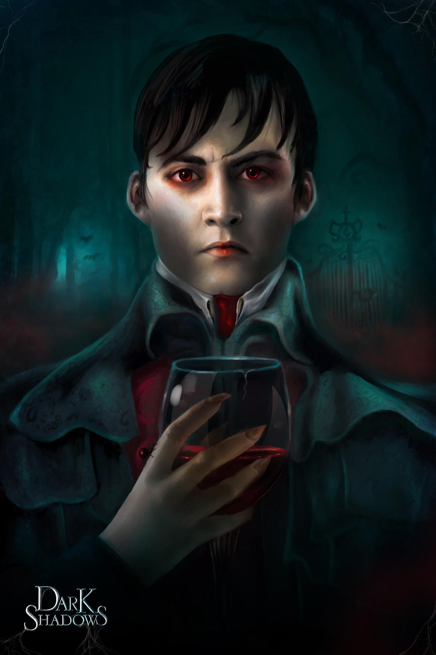
Here is my entry for the Dark Shadows competition! I am very pleased with how it turned out. Even though the film takes place in the 70's, what I've always loved about Tim Burton's works is the Victorian aesthetic that they have, so I chose to run with that. The title of this piece is a quote from the trailer. I was really excited to participate in this because I've always loved the dark, whimsical nature of Burton's work. Well, I guess all that's left to say is "enjoy!" and make sure to take a look at the other entries, too! There's some super awesome work out there.
Edits 4/23: Lots of edits today!! I'm just making sure it's 100% done and that I'm completely satisfied before the contest ends tomorrow. I added much more detail to his face and hands and fixed a few things that looked weird. I added more sponge brushwork and detail to the background to give it a painterly look, incorporated some red, and added a few Burton-esque environmental elements, such as the curly tree branches, that I've always adored. I also attempted to make Barnabas look more like Johnny Depp. I made the wine glass more realistic and gave it a crack (I mean, he can't expect the stemware to have aged as well as he did!) Lastly, I added a Black Widow spider on his hand, and some cobwebs in the corners both to give the piece some boundaries and to connect the logo more to the image. (Smile)") I sincerely hope you enjoy it!! I'm much happier with it now.
I sincerely hope you enjoy it!! I'm much happier with it now.
Edit: I would like to thank everyone who has viewed, commented on, and added this piece to their favorites or collections so much! I'm not what you would call a "famous" deviant, so the attention that you guys have given to this is both surprising and heart-warming to me. Thanks for all of your support!!
Edits 4/23: Lots of edits today!! I'm just making sure it's 100% done and that I'm completely satisfied before the contest ends tomorrow. I added much more detail to his face and hands and fixed a few things that looked weird. I added more sponge brushwork and detail to the background to give it a painterly look, incorporated some red, and added a few Burton-esque environmental elements, such as the curly tree branches, that I've always adored. I also attempted to make Barnabas look more like Johnny Depp. I made the wine glass more realistic and gave it a crack (I mean, he can't expect the stemware to have aged as well as he did!) Lastly, I added a Black Widow spider on his hand, and some cobwebs in the corners both to give the piece some boundaries and to connect the logo more to the image.
Edit: I would like to thank everyone who has viewed, commented on, and added this piece to their favorites or collections so much! I'm not what you would call a "famous" deviant, so the attention that you guys have given to this is both surprising and heart-warming to me. Thanks for all of your support!!
Image size
2500x3750px 2.66 MB
© 2012 - 2024 elbarien
Comments188
Join the community to add your comment. Already a deviant? Log In
First of all, i personally believe that art is relative, and have no right or wrong, better or worse. It is from the constructs of our own society that we build limitations and interpret right or wrongs. However, I do believe art is an interpretation of our visual reality represented by line, form, light and shadow, and color. And we are merely striving to strengthen our ability to become a stronger illusionist, with style providing a means critique and guide. (fine arts, comic, realism, etc.) So since we're "stuck" in this kind of reality" let's get on with the critique.
Your vision is awesome. I do believe you are original, but i feel where your vision and originality excels, your technique is struggling, and as result the impact will struggle. So lets focus on technique, and i feel that will improve the overall impact.
Forms: The most obvious "problem" i see is how almost all the forms seem flat. For example the hand. I understand maybe, your references appeared that way and you copied it to the T, but, when choosing a pose make sure it is one that pushes the form, rather, stays in the area. The hand doesn't same to rap around the cup which it is holding. I would suggest turning the knuckles so that they are partly on the side of the cup, making the thumb visible. The overall form of his shoulders, makes him seem more like a table, with drapery his coat as the table cloth. His shoulders seemed forced. That is to say, you wanted them to create a frame like form, that extends to the border. Anatomically, i dont think it is plausible. To fix this, i would darken have the form not touching the edges of the canvas, and darkened out just like you have on the bottom of the canvas.
Edges: All the edges have a stark liquid consistency. There is so far two kinds of edges, hard and harder. This is what really makes things look flat. A graphic image is graphic, cause many times, there is strong outline to define the form. Whatever form it is, be it the light shadow, or line itself. They are all separated by distinct individual forms. The hardest edges i see is where the hair meets the background. Another good example is his chin and ears. They have the same value on both side. Same exact value. There is a perfect halo for is colar up to his ear, relatively the same value. Also flattening the picture. Softening and loosing edges is a great way to start. Softening means the form is really blurry, and losing it, is little have it blend in with whatever form is around it. think of 1 2 3 reads. Hit one spot with very bright, think of the medium area, then that last one just a hint. And repeat the patten with the over all picture. So 123's within 3 or four hierarchies of 123s. like you have done to a degree already. His left eye is brightest, right dim, shoulders dimmer, and hand even dimmer then that. With in those sub categories, have a stronger separation of 123. The lights can be arbitrary, masters have done it all the time, like wha? how'd that light his his eye. At the same time consider, the object still have form. So for the chest, it would be the peak of the form, and shoulders would recede. So while you decide where the light hits the strongest, it must maintain that appearance of a semi cylindrical form.The reflected light on the edge of the colar on the left extends from behind his head, all the way to where it is suppose to be the front of his right shoulder.
The rim lights you use to define the flaps on his shoulders have the same value all the way down.
Value separation for background to foreground, there is know separation in value.
Symmetry is a difficult one to pull off, this is where story telling comes in and can be debated up and down, and should be taken with a grain of salt, whatever that means... The imagery in the background don't really say much, i would envision the witch and the ghost lady friend of his would make much strong compelling subject matter, and they're respective color would provide some asymmetry in a very symmetrical piece. Warm versus cold lighting might play well as two different light sources behind him. I would also suggest, whatever you do to the background, make it twice as light as it already is, to give a strong separation of grounds.
Lastly color. Color is always last and is secondary to any painting drawing. If form holds up, color can be semi arbitrary. I think you've made a great choice green and re, are complimentary, making the color of his eyes a great focal point. However you have diminished that by distributing the red in other parts of picture. I would suggest desaturating as well as lowing the value of the other reds. And remove the smokey red for a more natural, cyan turquoise fog.
I know the judging is already been done, but i feel your piece should have ranked amongst the top ten. Good luck on your art journey, and always fun, you know what you'll know what you are doing, if you just keep doing.